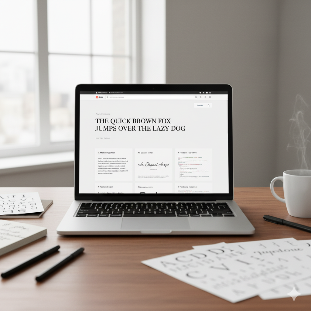
Typography sounds like a modest design detail — just the fonts, the letters. But in the digital age, it’s much, much more than that. On a website, typography is the silent narrator of your brand story; it’s the voice of your content, the visual rhythm your visitors follow. When done right, it elevates your site. When done poorly, it can make your message fade away. In this article, we’ll walk through how typography shapes a website’s look and feel, and we’ll give you actionable insights to use in your next web design project.
1. The Role of Typography in First Impressions
When a user lands on your website, before they read a single word they already form judgments — about clarity, professionalism, brand tone. Typography influences those judgments.
- A crisp, modern sans-serif font with well-spaced lines suggests cleanliness, efficiency, modernity. (See tips on readability below.)
- A decorative or script font may signal creativity, elegance, or luxury — but if over-used, it can undermine readability and trust.
- If fonts appear inconsistent, amateurish, or mismatched, that inconsistent typography translates into perceptions of inconsistent brand quality. According to industry commentary: “When a website’s typography works, I hardly notice it. But it’s often glaring when it fails.” HubSpot Blog+2Medium+2
Since your website may serve as your primary storefront, making sure typography delivers the right first impression is critical.
2. Readability & User Experience: Typography’s Technical Backbone
Beyond aesthetics, typography must serve people. Good type on a website supports how readers consume content — how they scan, how they stay, how they act.
Here are some key factors:
2.1 Font Choice & Legibility
Choose typefaces that render well on screens, across devices. Systems like the one described by designers emphasise: readability “across all devices is paramount.” Fiverr.com+1
Avoid very thin, overly decorative fonts for body copy. Make sure kerning (spacing between letters), x-height, and letterforms support quick reading. HubSpot Blog
2.2 Line Height, Spacing & Measure
Spacing between lines (leading) significantly impacts readability. For example:
“Leading is the space between the lines of type in a body of copy … correctly spaced lines make it easier for a reader to follow the type.” Smashing Magazine
For web layouts, you’ll want to ensure that the line-length (measure) is comfortable (often ~45-75 characters per line) and that line height gives breathing room.
2.3 Hierarchy & Contrast
A well-designed typographic system uses size, weight, style (italic, uppercase) to guide the reader: headings, subheadings, body text. The visual hierarchy helps the user scan and pick up what’s important. eLearning Industry+1
Contrast (font weight, size, color) must be enough so the text stands out from its background and invites reading.
2.4 Responsive Typography
With varied screen sizes—from mobile phones to large monitors—typography must adapt. Responsive typography ensures fonts scale, line-height adjusts, and legibility is maintained. eLearning Industry+1
Ignoring this leads to sites that look fine on desktop but become unreadable on mobile.
Need Help With Your Marketing or Website?
Not getting enough leads or sales? Get a free consultation and discover how to improve your website and marketing.
- Find out what may be stopping visitors from contacting you
- Discover where your website or marketing could perform better
- Get clear recommendations to improve leads, calls, and conversions
3. Brand Identity & Emotional Tone Through Typography
Typography doesn’t just tell your message — it helps shape the message. The fonts you choose carry emotion, influence perception, and reinforce brand identity.
- A serif font may convey tradition, reliability, elegance. HubSpot Blog
- A geometric sans-serif speaks to modernity, tech, minimalism. instapage.com+1
- A hand-written or script style adds warmth or personality, often used for specific sections (quotes, testimonials) rather than body copy. webflow.com
Consistent typography across every page of your site (and across other brand materials) builds recognition and trust. repunext.com
In short: Typography becomes a voice. Choose your tone. Align it with your brand’s personality. Let it carry your message before a visitor reads a single line.
4. Practical Typography Strategies for Website Designers
Let’s move from concept to action — here are strategies you can apply right away.
4.1 Limit Font Families
Stick to 2-3 typefaces maximum. Using too many gives a chaotic, unprofessional feel. As noted: “Too many fonts can make your website look cluttered and unprofessional.” HubSpot Blog+1
Typically: One for headings, one for body text, maybe one accent font for special elements.
4.2 Define a Clear Type Scale
Create a typography hierarchy: H1, H2, H3, body, caption. Decide font-sizes, weights, styles in advance. Consistency matters.
On line-height: a rule of thumb from Smashing Magazine: “If you set the type at 12 pt, a 15 pt or 16 pt leading should work well on the web.” Smashing Magazine
4.3 Ensure Contrast & Accessibility
Select font colors that meet accessibility contrast ratios. Avoid light grey on white or vivid color combinations that strain the eye. From eLearning insights: accessibility is key. eLearning Industry
Test on small screens and in different browsers. Verify that resizing text doesn’t break the layout.
4.4 Choose Fonts That Reflect the Brand and Content
If you’re designing for a law firm: a clean serif or neutral sans might be appropriate.
If you’re designing for a creative agency: you might choose something bold, expressive, but ensure readability is maintained.
Ask: What tone do we want? What audience are we speaking to? Let typography support that.
4.5 Optimize for Performance
Custom web fonts are great, but they can slow page loading. Try to load only the weights you need, use font-display swap, preload the font, and define fallback system fonts for users with slow connections.
Also consider: variable fonts are getting more adoption and can help with performance while offering flexible type weights.
4.6 Test & Iterate
Don’t assume your typographic decisions will work without testing. Example: One UX case study found that after redesigning typography (switching to a modern readable font, establishing size hierarchy, boosting contrast), a startup’s time-on-page increased by 22 % and the bounce rate dropped. Medium
Use real users, different devices, mobile vs desktop. Make adjustments.
5. Common Typography Mistakes to Avoid
- Using decorative fonts for body text: hard to read, especially on mobile or for long passages.
- Too many font families in one site: creates visual noise.
- Ignoring line-height and spacing: leads to “dense” text that discourages reading.
- Low color-contrast text: accessibility fails, some users get frustrated.
- Not factoring in responsive: large headings might squeeze on mobile, or lines become too short/long.
- Failing to test on real devices/browsers: what looks fine on desktop may break on mobile or older browsers.
6. Putting It All Together — A Mini Case Study Scenario
Imagine you’re designing a website for a boutique eco-travel agency. Here’s how you might apply typographic strategy:
- Brand tone: adventurous, refined, eco-conscious.
- Choose a sans-serif for body text (legible, clean) and a serif or display font for headings to add personality and elegance.
- Keep font families to two.
- Headings: say 48 px on desktop for H1, 32-36 px for H2, with sufficient line-height. Body text maybe 16 px with line-height 24-28 px on desktop, scaling for mobile.
- Colors: dark charcoal text on soft off-white background for contrast and a natural feel.
- Ensure responsive: on mobile the heading size might drop to 32 px, body to 14 px, but spacing remains comfortable.
- Test: Check readability on an old smartphone. Verify the fonts load fast, fallback is OK.
By doing this, typography becomes a subtle but powerful part of the brand experience: it tells visitors “we’re thoughtful, easy-to-travel with, polished yet relaxed.”
7. The Long Tail Benefit: Why Typography Matters for SEO & Conversion
Good typography doesn’t only help users — it helps search engines and conversions. Here’s how:
- Better readability = users stay longer, bounce less → positive behavioral signals to search engines.
- Clear headings help Google understand your content structure (H1, H2, H3) → benefits SEO.
- A readable site encourages conversion: when users can scan and understand, they are more likely to act.
- Mobile-friendly typography supports Google’s mobile-first indexing.
So typography is not merely aesthetic—it’s part of your website’s performance and growth.
8. Final Thoughts & Action Checklist
Typography may not be the flashiest part of web design, but in many ways it’s one of the most foundational. If you ignore it, you risk undermining everything else: design, messaging, user experience, brand trust. If you invest in it, you elevate everything.
Action checklist before launching your site:
- Choose 1–3 typefaces maximum.
- Define type scale: sizes, weights for headings, body, captions.
- Set line-height and measure (characters per line) to optimize readability.
- Ensure contrast and accessibility (colors, size, spacing).
- Test responsiveness: mobile, tablet, desktop.
- Review brand tone: do the fonts reflect your brand’s personality?
- Check performance: web font loading, fallback system fonts, minimize weights.
- Monitor user behavior post-launch: bounce rate, time-on-page, mobile versus desktop.
- Iterate typography if metrics or feedback suggest readability or engagement issues.
In Summary
Typography is the unsung hero of web design. It’s the voice of your content, the tone of your message, the architecture of your user experience. When you give typography the attention it deserves, it shapes your site’s look, feel, readability, brand perception—and even its SEO and conversion performance. Make typography intentional, test it, and let it serve your goals.