In the highly competitive online plumbing industry, capturing a customer’s attention and converting visits into calls is critical. One tool that many plumbing companies overlook or mismanage is the emergency call button on their websites. Done right, an emergency call button can become a lifeline for homeowners facing urgent plumbing crises—burst pipes, overflowing toilets, or heating system failures—and it can dramatically improve your conversion rates.
In this article, we’ll explore why emergency call buttons matter for plumber sites, what makes their design effective, and how to optimize them for maximum user engagement and business growth.
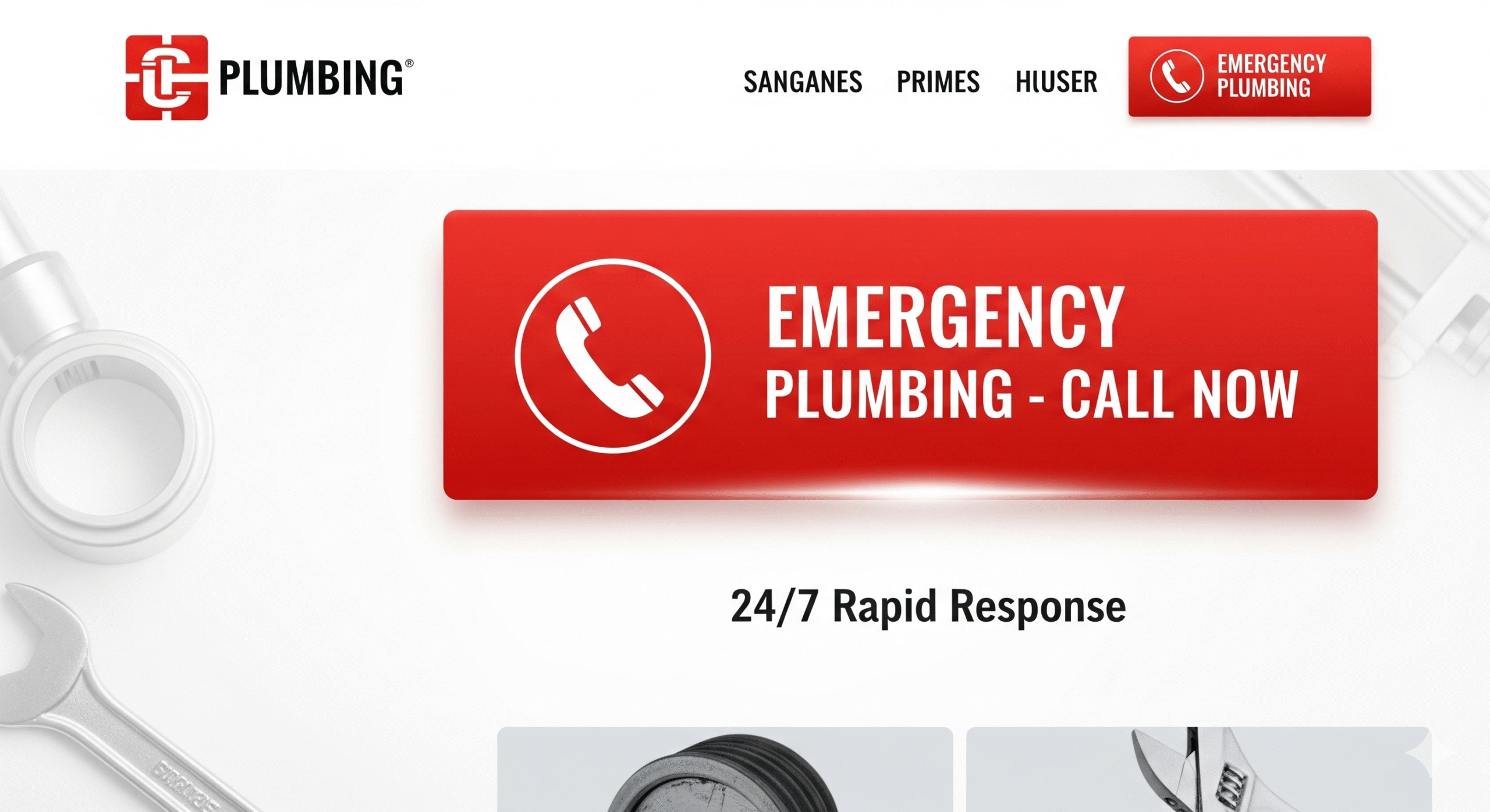
Why Every Plumbing Website Needs an Emergency Call Button
When your pipes burst at 2 AM or your water heater stops working on a freezing morning, the last thing you want is to hunt for a plumber’s contact information. Your website’s emergency call button needs to be:
Instantly visible
Easy to use
Available on all devices
Plumbing Emergencies Don’t Wait — Neither Should Your Website Visitors
Plumbing emergencies are unpredictable and stressful. Customers in crisis don’t have the time or patience to navigate through multiple pages or search for contact info. A clear, prominently placed emergency call button reduces friction and frustration—transforming a potential customer’s urgent need into a quick phone call.
Characteristics of an Effective Emergency Call Button on Plumbing Sites
When designing or refining your emergency call button, it’s important to understand what makes it work well for users. Here are some key features:
- Prominent Placement: Above the Fold is a Must
Your emergency call button should be one of the first things visitors see when landing on your site. Ideally, place it in the header or top right corner, so it’s accessible regardless of which page users visit.
- Eye-Catching Design: Use Contrasting Colors and Bold Text
The button must stand out. Use a contrasting color from your site’s palette and a clear, concise call-to-action (CTA) like “Emergency? Call Now!” or “24/7 Emergency Plumbing Service”. Avoid generic phrases like “Contact Us” which don’t convey urgency.
- Mobile Optimization: One-Tap Calling is Essential
Since many users will visit your site on smartphones, ensure the button is easily clickable on mobile devices. Use click-to-call functionality so users can dial directly by tapping the button—no need to copy numbers or navigate away.
- Persistent Visibility: Sticky Buttons and Floating Bars
Make your emergency call button sticky or use a floating action button that stays visible even when users scroll down pages. This guarantees immediate access at all times.
Need Help With Your Marketing or Website?
Not getting enough leads or sales? Get a free consultation and discover how to improve your website and marketing.
- Find out what may be stopping visitors from contacting you
- Discover where your website or marketing could perform better
- Get clear recommendations to improve leads, calls, and conversions
How to Implement an Emergency Call Button: Technical Best Practices
Now that we understand the design essentials, here are practical tips for implementation that avoid common pitfalls.
Use HTML5 for Click-to-Call
The standard way to enable phone calls on websites is the tel link:
This works on both desktop and mobile, but on mobile devices, it launches the phone dialer instantly.
Optimize for Speed and Accessibility
Your emergency call button should load quickly and be accessible to all users, including those with disabilities.
Use ARIA labels to improve screen reader compatibility
Avoid heavy animations that slow page load
Test contrast ratios to meet accessibility standards
Use Analytics to Track Button Clicks
Integrate event tracking with tools like Google Analytics or Hotjar to measure how many visitors use the emergency call button. This data will inform you how well the button converts and where you might improve.
Case Study: How One Plumbing Company Boosted Emergency Calls by 40% With a Redesigned Call Button
Let’s take a real-world example to demonstrate impact.
Background
XYZ Plumbing, a mid-sized company serving a metropolitan area, noticed low emergency call volume despite a steady influx of website visitors during off-hours.
Problem
Their original site buried the emergency number in the footer, with no clear button or CTA.
Solution
They implemented a floating, red emergency call button on every page with text: “Need Emergency Help? Call Now 24/7!” The button was optimized for mobile with click-to-call.
Results
Within three months, emergency call conversions increased by 40%, and overall customer satisfaction scores rose due to faster response times.
Long-Tail SEO Strategy: How Emergency Call Buttons Improve Local Plumbing Leads
If you want your plumbing business to rank high in local search results, optimizing your emergency call button is an essential part of your SEO and conversion strategy.
Optimize for “Emergency Plumber Near Me” and Related Phrases
Long-tail keywords like “emergency plumber near me open now” or “24-hour plumbing repair emergency” often bring highly motivated visitors. Your emergency call button should reinforce this urgency and direct these users immediately to phone contact.
Integrate Location-Based CTAs
For example: “Emergency Plumbing in [City Name]? Call Now!” This enhances relevance and improves click-through rates.
Additional Website Features That Complement Emergency Call Buttons
An emergency call button alone won’t guarantee success. Combine it with these features to create a seamless user experience.
Live Chat Support for Immediate Questions
Adding live chat allows users to ask quick questions if they’re unsure about calling directly, building trust and increasing engagement.
Clear Contact Information on Every Page
Besides the emergency button, include your phone number in the footer or header consistently so visitors always have access.
FAQs About Plumbing Emergencies
Educate visitors about common emergencies, so they feel confident about when to call and what to expect.
Common Mistakes to Avoid When Designing Emergency Call Buttons on Plumbing Sites
Hiding the Button in Menus or Footers
Your emergency call button should never be hidden or hard to find. Avoid burying it in drop-down menus or footers where users won’t see it.
Using Vague or Passive Language
CTAs like “Contact Us” or “Get in Touch” don’t convey urgency. Use active, clear language like “Call Now for Immediate Help.”
Poor Mobile Usability
A small, unclickable button on mobile can cost you calls. Make it large enough and use a sticky position.
Future Trends: Voice Search and AI Integration for Emergency Plumbing Calls
As voice assistants become more common, integrating voice search commands like “Call emergency plumber near me” will become critical. Additionally, AI-powered chatbots may help qualify emergencies before connecting customers with live agents.
Summary: Designing Emergency Call Buttons That Convert Visitors Into Customers
To recap:
Place emergency call buttons prominently and above the fold
Use bold, contrasting colors and urgent, clear CTAs
Make sure buttons are mobile-optimized with click-to-call features
Use sticky or floating buttons to maintain visibility
Track user interactions to improve effectiveness
Complement buttons with live chat, FAQs, and consistent contact info
By following these strategies, plumbing companies can increase emergency call volume, improve customer satisfaction, and stand out in a crowded online market.
If you’re a plumbing business owner or web designer, investing in a well-designed emergency call button isn’t just smart—it’s essential. When a customer faces a plumbing emergency, your website should be the first place they think of, and your call button the first thing they click.